Overview
Repertoire Designer 202x automatically calculates chart-axis ranges, tick intervals, and labels from the underlying dataset. Automatic configuration is suitable for most reports, but it may not always produce the required scale or layout.
For example, a dataset with a highest value of 640 may produce an automatically calculated Y-axis whose final labelled tick does not provide the preferred visual boundary. A fixed maximum of 700 and an interval of 100 may provide a clearer and more consistent presentation.
Composite charts introduce an additional consideration, they may contain multiple X-axes and Y-axes. Each axis is assigned an index and can be configured independently through the chart’s Script tab.
This guide explains how to:
- Identify the axis that a script will modify.
- Set fixed minimum and maximum axis values.
- Configure different ranges for the left and right Y-axes.
- Control the interval between numeric tick labels.
- Restore automatic axis scaling.
- Format the numbers displayed on an axis.
- Hide an entire axis or selected axis components.
- Control X-axis labels in composite charts.
- Adjust axis margins, direction, titles, and gridlines.
[Note]
Only add the scripts required for the intended chart presentation.
Understanding Chart Axes
Charts generally contain two types of axes:
| Axis type | Description | Script method |
|---|---|---|
| Domain axis | Represents categories, dates, or other X-axis values | plot.getDomainAxis() |
| Range axis | Represents numeric Y-axis values | plot.getRangeAxis() |
A standard chart normally contains one domain axis and one range axis. A composite chart may contain multiple axes, which are referenced by index:
plot.getRangeAxis(0);
plot.getRangeAxis(1);
The index identifies the order in which the axis is configured. It does not permanently identify the side on which the axis appears.
For example, a particular composite chart may use:
| Axis index | Position |
|---|---|
0 |
Right Y-axis |
1 |
Left Y-axis |
Another chart may use the opposite arrangement. The actual position is determined by the subplot order and axis-location settings.
Step 1: Access The Chart Script
In Repertoire Designer 202x, locate the required chart or composite chart.
Launch the Chart Wizard. Navigate to the Script tab.
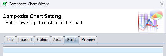
The script entered in this tab is executed while Repertoire Designer 202x builds the chart. It changes the chart’s presentation but does not modify the original datasource or its values. Multiple statements can be added to configure different properties of the same axis or different axes independently.
Step 2: Identify The Required Axis
Before applying several settings, determine which axis index controls the side that needs to be modified.
For example, temporarily add:
plot.getRangeAxis(0).setRange(0.0, 800.0);
The statement controls range axis 0: Preview the chart and observe which Y-axis changes.
If this changes the right Y-axis, axis 0 controls the right side in that chart. The other axis can then normally be accessed with:
plot.getRangeAxis(1);
For the current example:
plot.getRangeAxis(0).setRange(0.0, 900.0);
plot.getRangeAxis(1).setRange(0.0, 700.0);
The first statement configures the right Y-axis. The second statement configures the left Y-axis.
Why The Axis Index Matters
The axis index is based on the chart’s subplot and axis configuration. Repertoire Designer does not guarantee that:
- Axis
0is always on the left.- Axis
1is always on the right.- The visual position matches the order of the chart series.
If an unintended axis changes, replace the index with the index assigned to the required subplot or review the axis location configured for each subplot.
Step 3: Set A Fixed Y-Axis Range
Automatic scaling calculates the Y-axis range from the available datasources. A fixed range may be used when reports require consistent scales, additional space above the highest value, or easier comparison between multiple charts.
A range consists of two boundaries:
- The lower bound, which defines where the axis begins.
- The upper bound, which defines where the axis ends.
For example, a chart containing a highest value of 760 can use a range from 0 to 800:
plot.getRangeAxis(1).setRange(0.0, 800.0);
In this statement:
getRangeAxis(1)selects range axis1.0.0defines the minimum value.800.0defines the maximum value.
The axis will cover the complete numerical range from 0 through 800.
Both axes can be configured together:
plot.getRangeAxis(0).setRange(0.0, 900.0);
plot.getRangeAxis(1).setRange(0.0, 700.0);
This configuration is useful when each dataset uses a different numerical scale.
[ Important Consideration ]
A fixed range overrides automatic scaling for the selected axis. Values outside the configured range may be clipped or excluded from the visible plotting area.
For example, with the axis maximum defined as
800, a value of840may be clipped or rendered beyond the visible plotting area. The range should therefore account for both current and expected values.
Step 4: Set Only The Minimum Or Maximum
The lower and upper limits can also be configured individually.
To set only the minimum:
plot.getRangeAxis(1).setLowerBound(100.0);
To set only the maximum:
plot.getRangeAxis(1).setUpperBound(800.0);
These methods are applicable when adjustment is required for only one boundary. For example, a range may be required to start at zero while retaining a separately defined upper limit.
Step 5: Control The Tick-Label Interval
The axis range and tick interval control different parts of the scale:
- The range determines where the axis begins and ends.
- The tick unit determines the numerical distance between displayed labels.
Setting a range from 0 to 600 does not guarantee that labels will appear every 100. Repertoire Designer 202x may still calculate the tick interval automatically.
To display labels in intervals of 100, add:
plot.getRangeAxis(1).setTickUnit(new Packages.org.jfree.chart.axis.NumberTickUnit(100.0));
Combined with a range from 0 to 600:
plot.getRangeAxis(1).setRange(0.0, 600.0);
plot.getRangeAxis(1).setTickUnit(new Packages.org.jfree.chart.axis.NumberTickUnit(100.0));
The resulting labels will be:
0, 100, 200, 300, 400, 500, 600
Use Different Intervals
Each axis can use a different tick interval:
plot.getRangeAxis(0).setTickUnit(new Packages.org.jfree.chart.axis.NumberTickUnit(100.0));
plot.getRangeAxis(1).setTickUnit(new Packages.org.jfree.chart.axis.NumberTickUnit(50.0));
This allows each scale to remain readable even when the associated datasets have substantially different values.
Avoid excessively small intervals because they may produce overlapping labels.
Step 6: Format The Numeric Labels
Number formatting controls how values are displayed. It does not change the underlying values or calculations.
A) Display Whole Numbers
plot.getRangeAxis(1).setNumberFormatOverride(new Packages.java.text.DecimalFormat("#,##0"));
Example output:
0
1,000
2,000
B) Display One Decimal Place
plot.getRangeAxis(1).setNumberFormatOverride(new Packages.java.text.DecimalFormat("#,##0.0"));
Example output:
0.0
100.0
200.0
C) Display Two Decimal Places
plot.getRangeAxis(1).setNumberFormatOverride(new Packages.java.text.DecimalFormat("#,##0.00"));
Example output:
0.00
100.00
200.00
Step 7: Control Y-Axis Visibility
Different parts of a Y-axis and X-axis can be hidden independently. Hiding an axis or its labels does not remove the associated dataset from the chart.
A) Hide The Entire Y-Axis Axis
To hide range axis 0:
plot.getRangeAxis(0).setVisible(false);
This hides:
- The axis title
- The axis line
- Tick marks
- Tick-label values
The plotted data remains visible.
B) Hide The Y-Axis Title
plot.getRangeAxis(0).setLabel("");
This retains the axis line, tick marks, and values.
A new title can be assigned with:
plot.getRangeAxis(0).setLabel("Revenue");
C) Hide The Y-Axis Tick Labels
plot.getRangeAxis(0).setTickLabelsVisible(false);
The numeric values are hidden, while the axis and its title remain available.
D) Hide The Y-Axis Tick Marks
plot.getRangeAxis(0).setTickMarksVisible(false);
This removes the small marks beside the numerical labels but retains the labels themselves.
E) Hide The Y-Axis Line
plot.getRangeAxis(0).setAxisLineVisible(false);
This removes the main axis line.
Step 8: Control X-Axis Visibility
The domain axis controls the categories or dates displayed along the X-axis.
A) Hide The Entire X-Axis
To hide the entire X-axis:
plot.getDomainAxis().setVisible(false);
This hides:
- The axis title
- The axis line
- Tick marks
- Tick-label values
The plotted data remains visible.
B) Hide The X-Axis Tick Title
plot.getDomainAxis(0).setLabel("");
This retains the axis line, tick marks, and values.
A new title can be assigned with:
plot.getDomainAxis(0).setLabel("Month");
C) Hide The X-Axis Tick Labels
plot.getDomainAxis().setTickLabelsVisible(false);
The category or date values are hidden, while the axis and its title remain available.
D) Hide The X-Axis Tick Marks
plot.getDomainAxis().setTickMarksVisible(false);
This removes the small marks above or below the category or date labels but retains the labels themselves.
The index controlling the top or bottom X-axis depends on the composite chart’s subplot and axis-location configuration.
Step 9: Apply Additional Axis Adjustments
A) Reverse An Axis
To display values in descending order:
plot.getRangeAxis(1).setInverted(true);
B) Add Space Around Automatically Scaled Data
To add a 5% margin below the data:
plot.getRangeAxis(1).setLowerMargin(0.05);
To add a 10% margin above the data:
plot.getRangeAxis(1).setUpperMargin(0.10);
Margins are most useful with automatic scaling. Their effect may not be visible when a fixed range has already been applied.
C) Control Range Gridlines
To hide horizontal gridlines:
plot.setRangeGridlinesVisible(false);
To display them:
plot.setRangeGridlinesVisible(true);
D) Control Domain Gridlines
To hide vertical gridlines:
plot.setDomainGridlinesVisible(false);
To display them:
plot.setDomainGridlinesVisible(true);
Full Example
The following script demonstrates several commonly used adjustments for a composite chart where range axis 0 appears on the right and range axis 1 appears on the left:
// Right Y-axis
plot.getRangeAxis(0).setRange(0.0, 900.0);
plot.getRangeAxis(0).setTickUnit(new Packages.org.jfree.chart.axis.NumberTickUnit(100.0));
plot.getRangeAxis(0).setNumberFormatOverride(new Packages.java.text.DecimalFormat("#,##0"));

// Left Y-axis
plot.getRangeAxis(1).setRange(0.0, 700.0);
plot.getRangeAxis(1).setTickUnit(new Packages.org.jfree.chart.axis.NumberTickUnit(100.0));
plot.getRangeAxis(1).setNumberFormatOverride(new Packages.java.text.DecimalFormat("#,##0"));

// X-axis
plot.getDomainAxis().setTickLabelsVisible(true);

// Gridlines
plot.setRangeGridlinesVisible(true);
plot.setDomainGridlinesVisible(false);
Modify the axis indexes, limits, intervals, and number formats according to the chart configuration and report requirements.
What This Guide Achieves
- Provides greater control over chart-axis ranges, intervals, and formatting.
- Supports independent configuration of axes in standard and composite charts.
- Controls the visibility and presentation of axes, labels, tick marks, and gridlines.
- Improves chart clarity and consistency across different reports.
- Customizes the chart presentation without changing the underlying data.