This recipe shows how to display Pointer in XY Line Chart in RML, as well as how to display the same set of time period data using different representations in PML.
Major steps include the following:
- How to display Pointer in XY Line Chart in report template (RML):
- Create a blank report template (HowToAddXYPointer.rml) using the datasource (FruitSales.ds).
- Add a XY Line Chart into the report template.
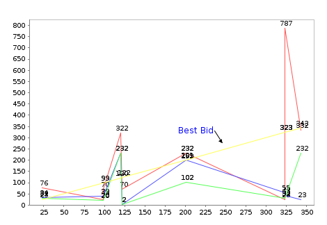
- Enter the following Java code into the “Script” tab of the Chart Wizard:importClass(Packages.org.jfree.chart.annotations.XYPointerAnnotation);
pointer = new XYPointerAnnotation(“Best Bid”, 250, 250, 400);
pointer.setFont(new java.awt.Font(“SansSerif”, 0, 12));
pointer.setPaint(java.awt.Color.blue);
pointer.setTextAnchor(Packages.org.jfree.ui.TextAnchor.HALF_ASCENT_RIGHT);
plot.addAnnotation(pointer); - How to display the same set of time period data using different representations in perspective (PML):
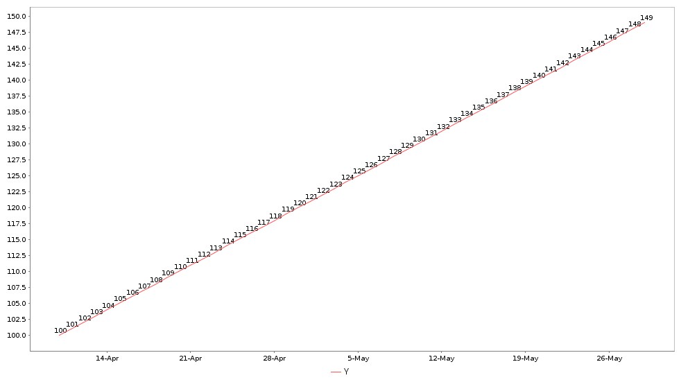
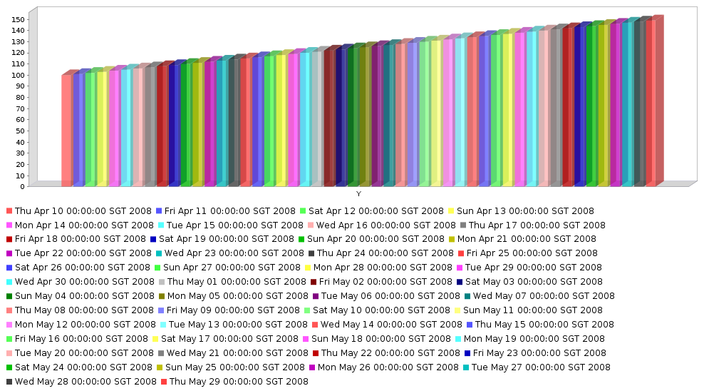
- Create a perspective (Sample.pml) using the datasource (TimePeriod.ds).
- Add two views (TimePeriod and TimePeriod1) both using the datasource (TimePeriod.ds).
- In the TimePeriod view, add an XY Line Chart and enter the Java code (as in the attached files) into the “Script” tab.
- In the TimePeriod1 view, add a Column 3D Chart and enter the Java code (as in the attached files) into the “Script” tab.
Screenshot of displaying Pointer in XY Line Chart in RML:
Screenshot of displaying time period data in XY Line Chart in PML:
Screenshot of displaying time period data in Column 3D Chart in PML:
To download the necessary files in this recipe, refer to the attached ZIP package.
TimeSeries.zip (5.9 KB)